Building UI for Cascaide
Goal: Learn how to build UI components in Cascaide that can participate in and observe graph execution and explore the UX possibilities this unlocks.
Agents are new, and perhaps chat isn’t the right UX primitive. With these tools, it becomes easier to craft novel user experiences. If you build something imaginative, do reach out — we’d love to showcase it (https://forms.gle/xJ4eSsmUPnYnhDJL7 )
Prerequisites
- React
- Understanding of the
useWorkflowanduseCascadehooks
Understanding WorkflowRenderer
If you look at the code for WorkflowRenderer, it is quite straightforward. All it does is:
- Look for active nodes
- Render UI components for all active UI nodes
<div>
  {uiNodes.map(nodeId => {
    const node = activeNodes[nodeId];
    const ComponentToRender = uiComponentRegistry[node.nodeName];
    if (!ComponentToRender) {
      console.error(`UI component for node '${node.nodeName}' not found.`);
      return null;
    }
    return (
      <div key={nodeId}>
        <ComponentToRender nodeId={nodeId} />
      </div>
    );
  })}
</div>
You can think of the viewport as a stage and the renderer as a conductor that reads from the list of active UI nodes.
WorkflowRenderer is unopinionated. It simply renders, your component decides everything else. Interesting UI/UX patterns emerge via two methods:
- Playing around with the outermost
divof theuiNodes - Using React portals
Your UI nodes are React components, it has an extra superpower, it can control and communicate with the graph.
There is a dedicated section for portals. Check out Portalling Agent UIs for more.
In this section, we discuss some ideas around what’s possible by playing with the outermost div of the uiNodes.
The image below shows some rough possibilities: a sticky banner node, a draggable agent UI overlay, a sidebar-like chat node, a task list UI node that portals, and a stack of UI nodes showing parallel agents in the bottom left.
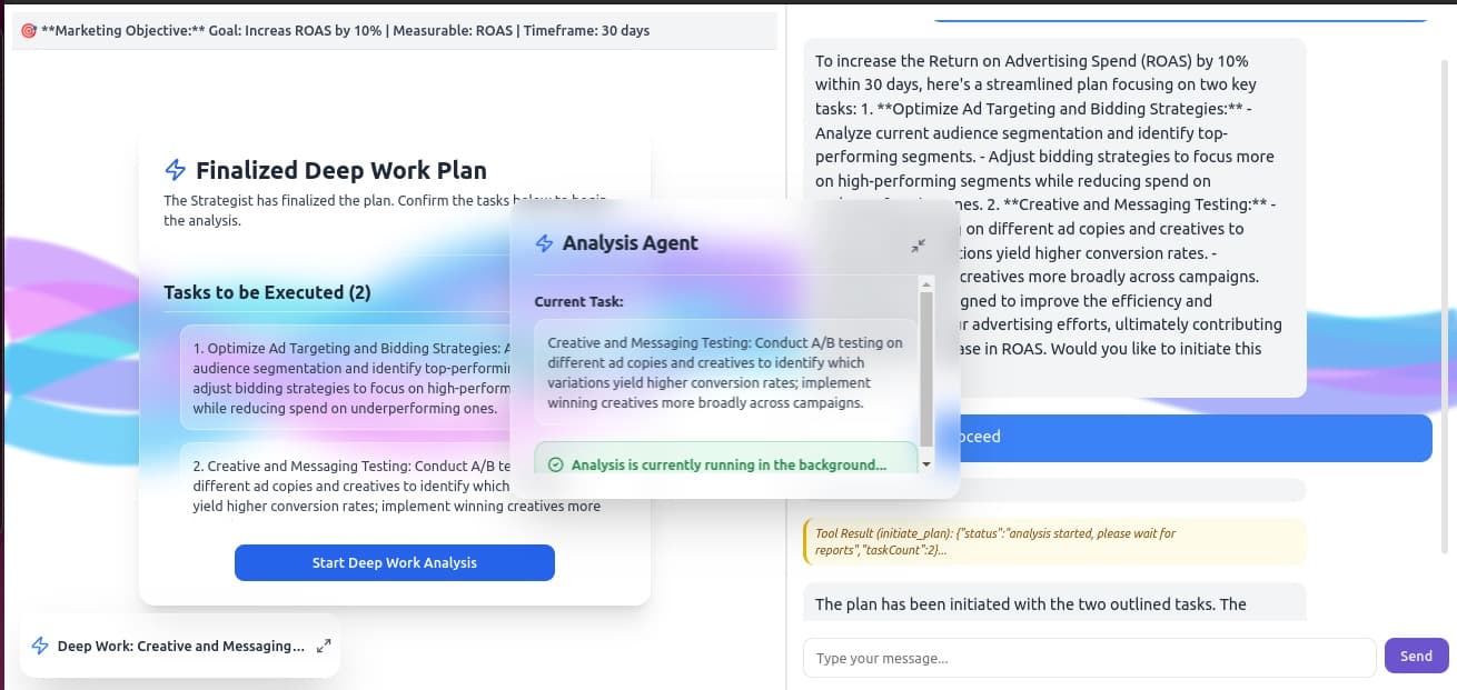
A few patterns worth calling out:
- Sticky banners — Pin a node to the top or bottom of the viewport as a persistent status bar.
- Draggable overlays — Float an agent UI as a moveable panel over the main content.
- Sidebars — Slide in a chat or task node alongside existing content.
- Stacked parallel agents — Render multiple concurrent agent nodes as a stack (bottom left).
- Portalled task lists — Use React portals to render a node’s UI into a designated space
More importantly, these are regular UI components. It can maintain its own state separate from the global workflow state, fetch data, make api calls, execute logic, communicate back with the graph, use any JS library inside, use any CSS approach, etc.
Placement Cheatsheet
The outermost div of your UI node component controls where it appears. Here are common effects and the CSS classes that produce them.
| Effect | Pattern | Key Classes |
|---|---|---|
| Block user until they act | Full-screen modal with backdrop | fixed inset-0 z-50 flex items-center justify-center bg-black/50 |
| Persistent status at top | Top banner | fixed top-0 left-0 w-full z-50 |
| Persistent status at bottom | Bottom banner | fixed bottom-0 left-0 w-full z-50 |
| Agent panel alongside app content | Right sidebar | fixed top-0 right-0 h-full w-80 z-40 |
| Floating panel over content | Corner overlay | fixed bottom-4 right-4 w-72 z-40 |
| Multiple agents visible at once | Stacked corner overlays | fixed bottom-4 right-4 w-72 — each active node stacks naturally |
| Render into a specific part of your app | Portal | See Portals |
These are Tailwind classes. If you’re using plain CSS, the equivalent properties are position: fixed, inset, z-index, width, and height.
Use these as a starting point and try ideas out.
Modifying the WorkflowRenderer
Depending on your use case, there is merit in modifying the renderer. Simply change the layout in which activeNodes are rendered. In general,
keep the renderer agnostic, but if needed feel free to modify it.